
7 Multiple Regression
Now that we are equipped with data visualization skills from Chapter 3, data wrangling skills from Chapter 5, and an understanding of the “tidy” data format from Chapter 4, we now proceed with data modeling. The fundamental premise of data modeling is to model the relationship between:
- An outcome variable \(y\), also called a dependent variable and
- An explanatory/predictor variable \(x\), also called an independent variable or covariate.
Another way to state this is using mathematical terminology: we will model the outcome variable \(y\) as a function of the explanatory/predictor variable \(x\). Why do we have two different labels, explanatory and predictor, for the variable \(x\)? That’s because roughly speaking data modeling can be used for two purposes:
- Modeling for prediction: You want to predict an outcome variable \(y\) based on the information contained in a set of predictor variables. You don’t care so much about understanding how all the variables relate and interact, but so long as you can make good predictions about \(y\), you’re fine. For example, if we know many individuals’ risk factors for lung cancer, such as smoking habits and age, can we predict whether or not they will develop lung cancer? Here we wouldn’t care so much about distinguishing the degree to which the different risk factors contribute to lung cancer, but instead only on whether or not they could be put together to make reliable predictions.
- Modeling for explanation: You want to explicitly describe the relationship between an outcome variable \(y\) and a set of explanatory variables, determine the significance of any found relationships, and have measures summarizing these. Continuing our example from above, we would now be interested in describing the individual effects of the different risk factors and quantifying the magnitude of these effects. One reason could be to design an intervention to reduce lung cancer cases in a population, such as targeting smokers of a specific age group with advertisement for smoking cessation programs. In this book, we’ll focus more on this latter purpose.
Data modeling is used in a wide variety of fields, including statistical inference, causal inference, artificial intelligence, and machine learning. There are many techniques for data modeling, such as tree-based models, neural networks/deep learning, and more. However, we’ll focus on one particular technique: linear regression, one of the most commonly-used and easy to understand approaches to modeling. Recall our discussion in Chapter 2.4.3 on numerical and categorical variables. Linear regression involves:
- An outcome variable \(y\) that is numerical
- Explanatory variables \(\vec{x}\) that are either numerical or categorical
Whereas there is always only one numerical outcome variable \(y\), we have choices on both the number and the type of explanatory variables \(\vec{x}\) to use. We’re going to the following regression scenarios, where we have
- A single numerical explanatory variable \(x\) in Chapter @(model1). This scenario is known as simple linear regression.
- A single categorical explanatory variable \(x\) in Chapter @(model2).
- Two numerical explanatory variables \(x_1\) and \(x_2\) in Chapter @(model3). This is the first of two multiple regression scenarios we’ll cover where there are now more than one explanatory variable.
- One numerical and one categorical explanatory variable in Chapter @(model3). This is the second multiple regression scenario we’ll cover. We’ll also introduce interaction models here.
We’ll study all 4 of these regression scenarios using real data, all easily accessible via R packages!
Needed packages
In this chapter we introduce a new package, moderndive, that is an accompaniment package to the ModernDive book that includes useful functions for linear regression and other functions and data used in later in the book. However because this is a relatively new package, we’re have to install this package in a different way than was covered in Section 2.3.
First, install the remotes package like you would normally install a package, then run the following line to install the moderndive package:
library(remotes)
# remotes::install_github("moderndive/moderndive")
Let’s now load all the packages needed for this chapter. If needed, read Section 2.3 for information on how to install and load R packages.
library(ggplot2)
library(dplyr)
library(moderndive)
7.1 Two numerical x
Much like our teacher evaluation data in Section 6.1, let’s now attempt to identify factors that are associated with how much credit card debt an individual will hold. The textbook An Introduction to Statistical Learning with Applications in R by Gareth James, Daniela Witten, Trevor Hastie and Robert Tibshirani is an intermediate-level textbook on statistical and machine learning freely available here. It has an accompanying R packaged called ISLR with datasets that the authors use to demonstrate various machine learning methods. One dataset that is frequently used by the authors is the Credit dataset where predictions are made on the balance held by various credit card holders based on information like income, credit limit, and education level. Let’s consider the following variables:
- Outcome variable \(y\): Credit card balance in dollars
- Explanatory variables \(x\):
- income in $1000’s
- credit card limit in dollars
- credit rating
- card holder’s age
- years of education
Let’s load the data and select() only the 6 variables listed above:
library(ISLR)
Credit <- Credit %>%
  select(Balance, Limit, Income, Rating, Age, Education)
Unfortunately, no information on how this data was sampled was provided, so we’re not able to generalize any such results to a greater population, but we will still use this data to demonstrate multiple regression. Multiple regression is a form of linear regression where there are now more than one explanatory variables and thus the interpretation of the associated effect of any one explanatory variable must be made in conjunction with the other explanatory variable. We’ll perform multiple regression with:
- A numerical outcome variable \(y\), in this case teaching credit card
Balance - Two explanatory variables:
- A first numerical explanatory variable \(x_1\), in this case credit
Limit - A second numerical explanatory variable \(x_2\), in this case
Income
- A first numerical explanatory variable \(x_1\), in this case credit
7.1.1 Exploratory data analysis
Let’s look at the raw data values both by bringing up RStudio’s spreadsheet viewer, although in Table 7.1 we only show 5 randomly selected credit card holders out of 400, and using the glimpse() function:
View(Credit)| Balance | Limit | Income | Rating | Age | Education | |
|---|---|---|---|---|---|---|
| 270 | 772 | 5565 | 39.1 | 410 | 48 | 18 |
| 212 | 799 | 5309 | 29.6 | 397 | 25 | 15 |
| 119 | 0 | 2161 | 27.0 | 173 | 40 | 17 |
| 250 | 98 | 1551 | 22.6 | 134 | 43 | 13 |
| 138 | 187 | 3613 | 36.4 | 278 | 35 | 9 |
glimpse(Credit)Observations: 400
Variables: 6
$ Balance <int> 333, 903, 580, 964, 331, 1151, 203, 872, 279, 1350, 1407,...
$ Limit <int> 3606, 6645, 7075, 9504, 4897, 8047, 3388, 7114, 3300, 681...
$ Income <dbl> 14.9, 106.0, 104.6, 148.9, 55.9, 80.2, 21.0, 71.4, 15.1, ...
$ Rating <int> 283, 483, 514, 681, 357, 569, 259, 512, 266, 491, 589, 13...
$ Age <int> 34, 82, 71, 36, 68, 77, 37, 87, 66, 41, 30, 64, 57, 49, 7...
$ Education <int> 11, 15, 11, 11, 16, 10, 12, 9, 13, 19, 14, 16, 7, 9, 13, ...Let’s look at some summary statistics:
summary(Credit) Balance Limit Income Rating Age
Min. : 0 Min. : 855 Min. : 10.4 Min. : 93 Min. :23.0
1st Qu.: 69 1st Qu.: 3088 1st Qu.: 21.0 1st Qu.:247 1st Qu.:41.8
Median : 460 Median : 4622 Median : 33.1 Median :344 Median :56.0
Mean : 520 Mean : 4736 Mean : 45.2 Mean :355 Mean :55.7
3rd Qu.: 863 3rd Qu.: 5873 3rd Qu.: 57.5 3rd Qu.:437 3rd Qu.:70.0
Max. :1999 Max. :13913 Max. :186.6 Max. :982 Max. :98.0
Education
Min. : 5.0
1st Qu.:11.0
Median :14.0
Mean :13.4
3rd Qu.:16.0
Max. :20.0 We observe for example
- The typical credit card balance is around $500
- The typical credit card limit is around $5000
- The typical income is around $40,000.
Since our outcome variable Balance and the explanatory variables Limit and Rating are numerical, we can compute the correlation coefficient between pairs of these variables. However, instead running the cor() command twice, once for each explanatory variable:
cor(Credit$Balance, Credit$Limit)
cor(Credit$Balance, Credit$Income)
We can simultaneously compute them by returning a correlation matrix in Table 7.2. We read off the correlation coefficient for any pair of variables by looking them up in the appropriate row/column combination.
Credit %>%
  select(Balance, Limit, Income) %>%
cor()| Balance | Limit | Income | |
|---|---|---|---|
| Balance | 1.000 | 0.862 | 0.464 |
| Limit | 0.862 | 1.000 | 0.792 |
| Income | 0.464 | 0.792 | 1.000 |
For example, the correlation coefficients of:
Balancewith itself is 1BalancewithLimitis 0.862, indicating a strong positive linear relationship, which makes sense as only individuals with large credit limits and accrue large credit card balances.BalancewithIncomeis 0.464, suggestive of another positive linear relationship, although not as strong as the relationship betweenBalanceandLimit.- As an added bonus, we can read off the correlation coefficient of the two explanatory variables,
LimitandIncomeof 0.792. In this case, we say there is a high degree of collinearity between these two explanatory variables.
Let’s visualize the relationship of the outcome variable with each of the two explanatory variables in two separate plots
ggplot(Credit, aes(x = Limit, y = Balance)) +
  geom_point() +
  labs(x = "Credit limit (in $)", y = "Credit card balance (in $)",
       title = "Relationship between balance and credit limit") +
  geom_smooth(method = "lm", se = FALSE)

ggplot(Credit, aes(x = Income, y = Balance)) +
  geom_point() +
  labs(x = "Income (in $1000)", y = "Credit card balance (in $)",
       title = "Relationship between balance and income") +
  geom_smooth(method = "lm", se = FALSE)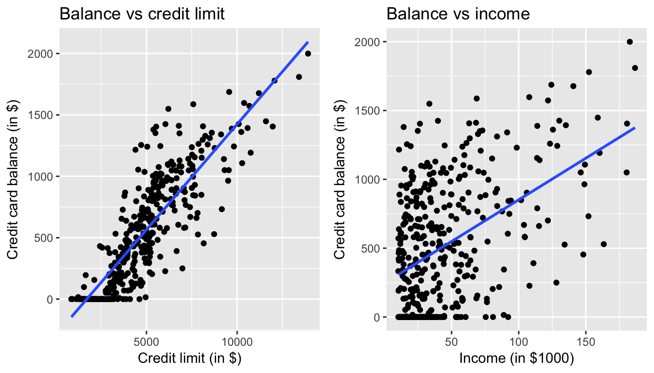
Figure 7.1: Relationship between credit card balance and credit limit/income
In both cases, there seems to be a positive relationship. However the two plots in Figure 7.1 only focus on the relationship of the outcome variable with each of the explanatory variables independently. To get a sense of the joint relationship of all three variables simultaneously through a visualization, let’s display the data in a 3-dimensional (3D) scatterplot, where
- The numerical outcome variable \(y\)
Balanceis on the z-axis (vertical one) - The two numerical explanatory variables form the x and y axes (on the floor). In this case
- The first numerical explanatory variable \(x_1\)
Incomeis on the x-axis - The second numerical explanatory variable \(x_2\)
Limitis on the y-axis
- The first numerical explanatory variable \(x_1\)
Click on the following image to open an interactive 3D scatterplot in your browser:

Previously in Figure 6.5, we plotted a “best-fitting” regression line through a set of points where the numerical outcome variable \(y\) was teaching score and a single numerical explanatory variable \(x\) bty_avg. What is the analogous concept when we have two numerical predictor variables? Instead of a best-fitting line, we now have a best-fitting plane, which is 3D generalization of lines which exist in 2D. Click on the following image to open an interactive plot of the regression plane in your browser.

7.1.2 Multiple regression
Just as we did when we had a single numerical explanatory variable \(x\) in Section 6.1.2 and when we had a single categorical explanatory variable \(x\) in Section 6.2.2, we fit a regression model and obtain the regression table in our two numerical explanatory variable scenario. To fit a regression model and obtain a table using get_regression_table(), we now use a + to consider multiple explanatory variables. In this case since we want to preform a regression of Limit and Income simultaneously, we input Balance ~ Limit + Income
Balance_model <- lm(Balance ~ Limit + Income, data = Credit)
get_regression_table(Balance_model)| term | estimate | std_error | statistic | p_value | conf_low | conf_high |
|---|---|---|---|---|---|---|
| intercept | -385.179 | 19.465 | -19.8 | 0 | -423.446 | -346.912 |
| Limit | 0.264 | 0.006 | 45.0 | 0 | 0.253 | 0.276 |
| Income | -7.663 | 0.385 | -19.9 | 0 | -8.420 | -6.906 |
How do we interpret these three values that define the regression plane?
- Intercept: -$385.18. The intercept in our case represents the credit card balance for an individual who has both a credit
Limitof $0 andIncomeof $0. In our data however, the intercept has limited practical interpretation as no individuals hadLimitorIncomevalues of $0 and furthermore the smallest credit card balance was $0. Rather, it is used to situate the regression plane in 3D space. - Limit: $0.26. Now that we have multiple variables to consider, we have to add a caveat to our interpretation: all other things being equal, for every increase of one unit in credit
Limit(dollars), there is an associated increase of on average $0.26 in credit card balance. Note:- Just as we did in Section 6.1.2, we are not making any causal statements, only statements relating to the association between credit limit and balance
- The all other things being equal is making a statement about all other explanatory variables, in this case only one:
Income. This is equivalent to saying “holdingIncomeconstant, we observed an associated increase of $0.26 in credit card balance for every dollar increase in credit limit”
- Income: -$7.66. Similarly, all other things being equal, for every increase of one unit in
Income(in other words, $1000 in income), there is an associated decrease of on average $7.66 in credit card balance.
However, recall in Figure 7.1 that when considered separately, both Limit and Income had positive relationships with the outcome variable Balance: as card holders’ credit limits increased their credit card balances tended to increase as well, and a similar relationship held for incomes and balances. In the above multiple regression, however, the slope for Income is now -7.66, suggesting a negative relationship between income and credit card balance. What explains these contradictory results? This is a phenomenon known as Simpson’s Paradox, a phenomenon in which a trend appears in several different groups of data but disappears or reverses when these groups are combined; we expand on this in Section 7.3.1.
7.1.3 Observed/fitted values and residuals
As we did previously, in Table 7.4 let’s unpack the output of the get_regression_points() function for our model for credit card balance
- for all 400 card holders in the dataset, in other words
- for all 400 rows in the
Creditdata frame, in other words - for all 400 points
regression_points <- get_regression_points(Balance_model)
regression_points| ID | Balance | Limit | Income | Balance_hat | residual |
|---|---|---|---|---|---|
| 1 | 333 | 3606 | 14.9 | 454 | -120.8 |
| 2 | 903 | 6645 | 106.0 | 559 | 344.3 |
| 3 | 580 | 7075 | 104.6 | 683 | -103.4 |
| 4 | 964 | 9504 | 148.9 | 986 | -21.7 |
| 5 | 331 | 4897 | 55.9 | 481 | -150.0 |
Recall the format of the output:
balancecorresponds to \(y\) the observed valuebalance_hatcorresponds to \(\widehat{y}\) the fitted valuereisdualcorresponds to the residual \(y - \widehat{y}\)
As we did in Section 6.1.3 let’s prove to ourselves that the results make sense by manually replicate the internal computation that get_regression_points() performs using the mutate() verb from Chapter 5
- First we compute a duplicate of the fitted values \(\widehat{y} = b_0 + b_1 \times x_1 + b_2 \times x_2\) where the intercept \(b_0\) = -385.179, the slope \(b_1\) for
Limitof 0.264, and the slope \(b_2\) forIncomeof -7.663 and store these inbalance_hat_2 - Then we compute the a duplicated the residuals \(y - \widehat{y}\) and store these in
residual_2
regression_points <- regression_points %>%
  mutate(Balance_hat_2 = -385.179 + 0.264 * Limit - 7.663 * Income) %>%
  mutate(residual_2 = Balance - Balance_hat_2)
regression_points| ID | Balance | Limit | Income | Balance_hat | residual | Balance_hat_2 | residual_2 |
|---|---|---|---|---|---|---|---|
| 1 | 333 | 3606 | 14.9 | 454 | -120.8 | 453 | -119.7 |
| 2 | 903 | 6645 | 106.0 | 559 | 344.3 | 557 | 346.4 |
| 3 | 580 | 7075 | 104.6 | 683 | -103.4 | 681 | -101.1 |
| 4 | 964 | 9504 | 148.9 | 986 | -21.7 | 983 | -18.7 |
| 5 | 331 | 4897 | 55.9 | 481 | -150.0 | 479 | -148.4 |
We see that our manually computed variables balance_hat_2 and residual_2 equal the original results (up to rounding error).
7.1.4 Residual analysis
Recall in Section 6.1.4, our first residual analysis plot investigated the presense of any systematic pattern in the residuals when we had a single numerical predictor: bty_age. For the Credit card dataset, since we have two numerical predictors, Limit and Income, we must perform this twice:
ggplot(regression_points, aes(x = Limit, y = residual)) +
  geom_point() +
  labs(x = "Credit limit (in $)", y = "Residual", title = "Residuals vs credit limit")

ggplot(regression_points, aes(x = Income, y = residual)) +
  geom_point() +
  labs(x = "Income (in $1000)", y = "Residual", title = "Residuals vs income")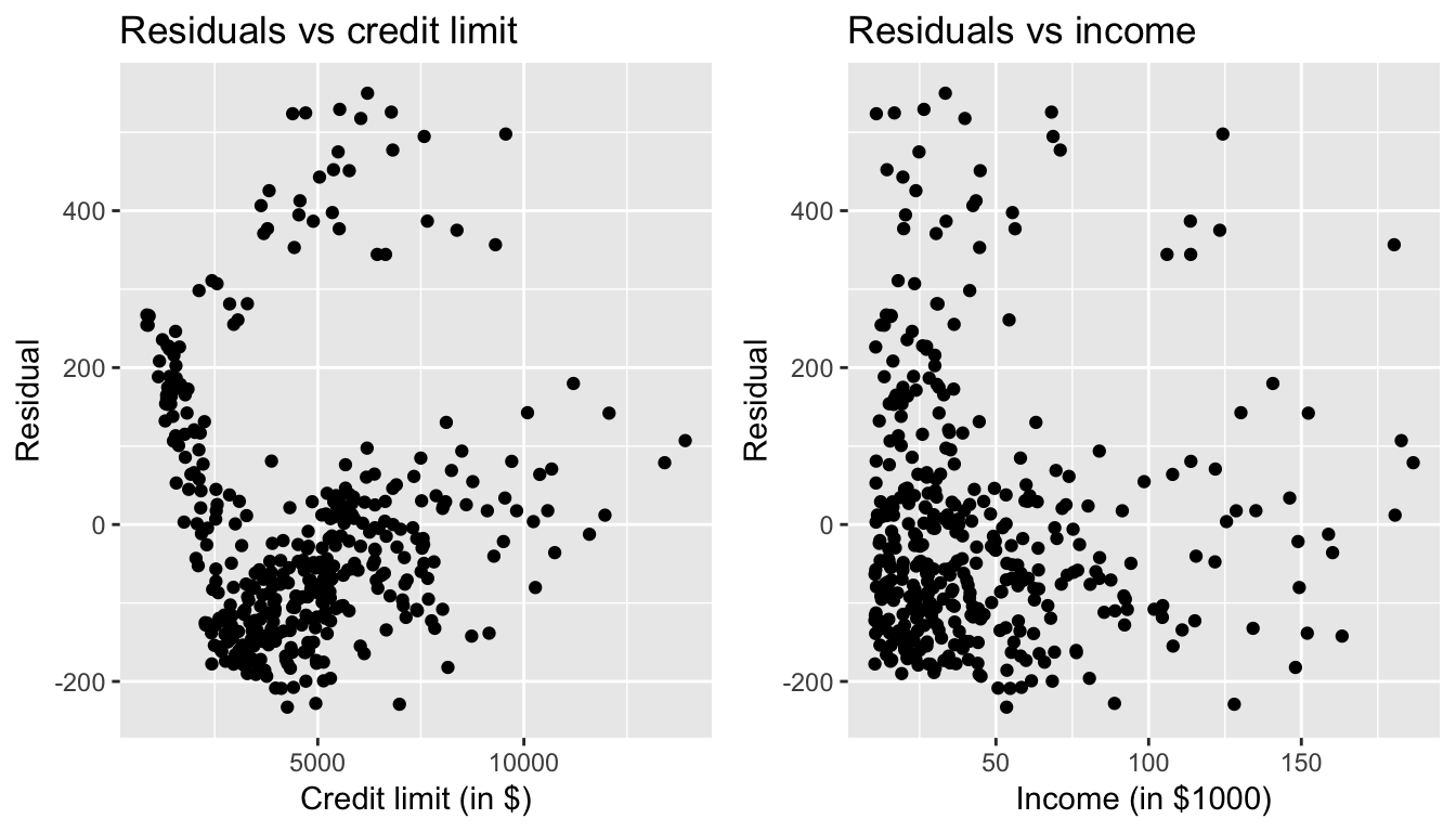
Figure 7.2: Residuals vs credit limit and income
In this case, there does appear to be a systematic pattern to the residuals, as the scatter of the residuals around the line \(y=0\) is definitely not consistent. This behavior of the residuals is further evidenced by the histogram of residuals in Figure @ref(fig:model3_residuals_hist). We observe that the residuals have a slight right-skew (a long tail towards the right). Ideally, these residuals should be bell-shaped around a residual value of 0.
ggplot(regression_points, aes(x = residual)) +
  geom_histogram(color = "white") +
  labs(x = "Residual")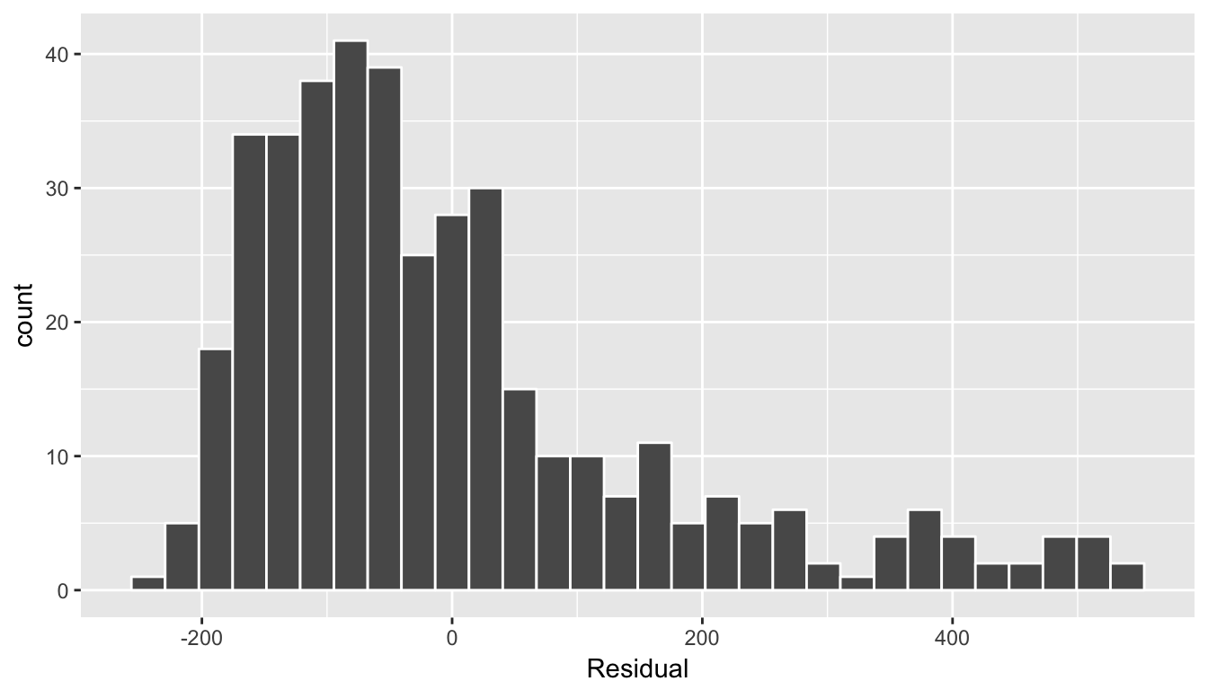
(#fig:model3_residuals_hist)Plot of residuals over continent
Another way to intepret this histogram is that since the residual is computed as \(y - \widehat{y}\) = balance - balance_hat, we have some values where the fitted value \(\widehat{y}\) is very much lower than the observed value \(y\). In other words, we are underfitting certain credit card holder’s balance by a very large amount.
7.1.5 Your turn
Repeat this same analysis but using Age and Rating as the two numerical explanatory variables. Recall the four steps we’ve been following:
- Perform an exploratory data analysis (EDA)
- Fit a linear regression model and get information about the model
- Get information on all \(n\) data points considered in this analysis.
- Perform a residual analysis and look for any systematic patterns in the residuals.
7.2 One numerical & one categorical x
Let’s revisit the instructor evaluation data introduced in Section 6.1, where we studied the relationship between
- the numerical outcome variable \(y\): instructor evaluation score
score - the numerical explanatory variable \(x\): beauty score
bty_avg
This analysis suggested that there is a positive relationship between bty_avg and score, in other words as instructors had higher beauty scores, they also tended to have higher teaching evaluation scores. Now let’s say instead of bty_avg we are interested in the numerical explanatory variable \(x_1\) age and furthermore we want to use a second \(x_2\), the (binary) categorical variable gender. Our modeling scenario now becomes
- the numerical outcome variable \(y\): instructor evaluation score
score - Two explanatory variables:
- A first numerical explanatory variable \(x_1\):
age - A second numerical explanatory variable \(x_2\), in this case
gender
- A first numerical explanatory variable \(x_1\):
7.2.1 Exploratory data analysis
load(url("http://www.openintro.org/stat/data/evals.RData"))
evals <- evals %>%
  select(score, bty_avg, age, gender)
We’ve already performed some elements of our exploratory data analysis (EDA) in Section 7.2.1, in particular of the outcome variable score, so let’s now only consider our two new explanatory variables
evals %>%
  select(age, gender) %>%
  summary()
age gender
Min. :29.0 female:195
1st Qu.:42.0 male :268
Median :48.0
Mean :48.4
3rd Qu.:57.0
Max. :73.0 cor(evals$score, evals$age)[1] -0.107In Figure ??, we plot a scatterplot of score over age, but given that gender is a binary categorical variable
- We can assign a color to points from each of the two levels of
gender: female and male - Furthermore, the
geom_smooth(method = "lm", se = FALSE)layer automatically fits a different regression line for each
ggplot(evals, aes(x = age, y = score, col = gender)) +
  geom_jitter() +
  labs(x = "Age", y = "Teaching Score", color = "Gender") +
  geom_smooth(method = "lm", se = FALSE)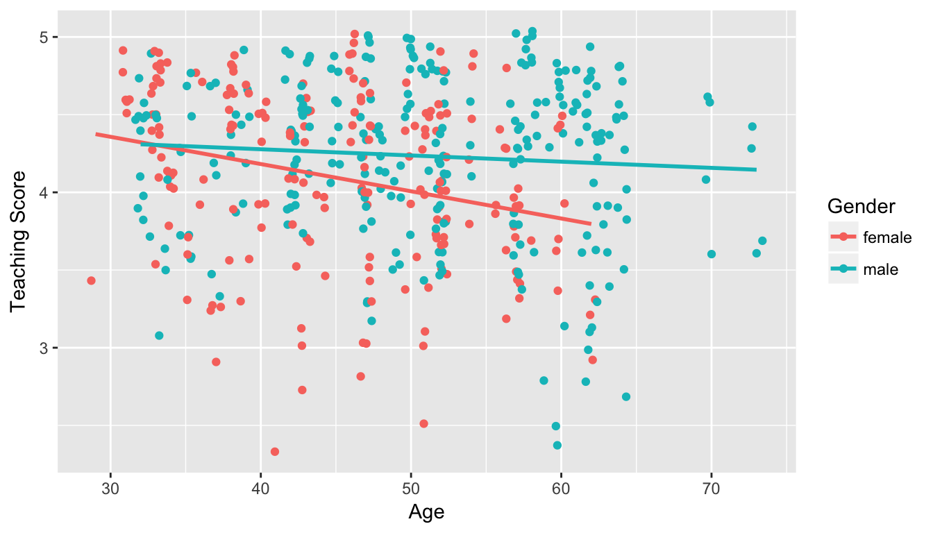
Figure 7.3: Instructor evaluation scores at UT Austin split by gender: Jittered
We notice some interesting trends:
- There are almost no women faculty over the age of 60.
- Fitting separate regression lines for men and women, we see they have different slopes. We see that the associated effect of increasing age seems to be much harsher for women than men. In other words, they have different slopes.
7.2.2 Multiple regression
Let’s now compute the regression table
score_model_2 <- lm(score ~ age + gender, data = evals)
get_regression_table(score_model_2)| term | estimate | std_error | statistic | p_value | conf_low | conf_high |
|---|---|---|---|---|---|---|
| intercept | 4.484 | 0.125 | 35.79 | 0.000 | 4.238 | 4.730 |
| age | -0.009 | 0.003 | -3.28 | 0.001 | -0.014 | -0.003 |
| gendermale | 0.191 | 0.052 | 3.63 | 0.000 | 0.087 | 0.294 |
The modeling equation for this is:
\[ \begin{align} \widehat{y} &= b_0 + b_1 x_1 + b_2 x_2 \\ \widehat{score} &= b_0 + b_{age} age + b_{male} \mathbb{1}[\mbox{is male}] \\ \end{align} \]
What this looks like is in Figure 7.4 below.
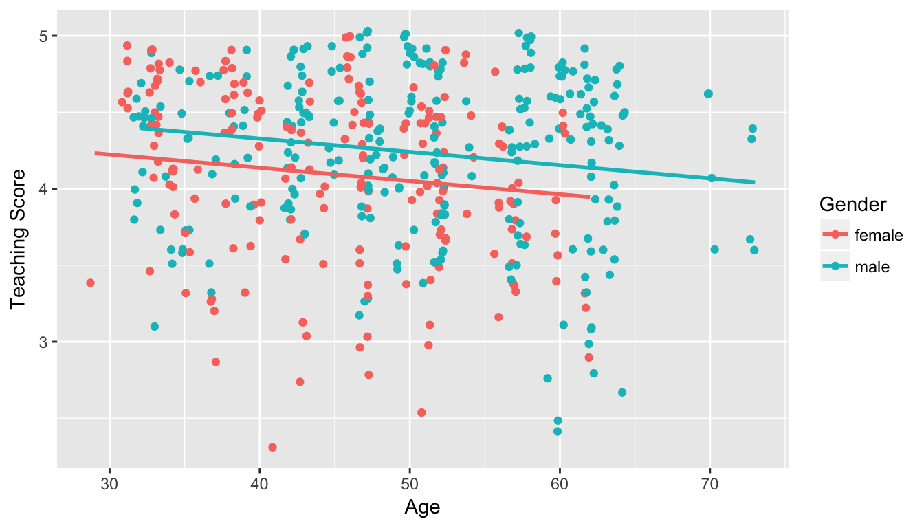
Figure 7.4: Instructor evaluation scores at UT Austin by gender: same slope
We see that:
- Females are treated as the baseline for comparison for no other reason than “female” is alphabetically earlier than “male”. The \(b_{male} = 0.1906\) is the vertical “bump” that men get in their teaching evaluation scores. Or more precisely, it is the average difference in teaching score that men get relative to the baseline of women
- Accordingly, the intercepts are (which in this case make no sense since no instructor can have age 0):
- for women: \(b_0\) = 4.484
- for men: \(b_0 + b_{male}\) = 4.484 + 0.191 = 4.675
- Both men and women have the same slope. In other words, in this model the associated effect of age is the same for men and women: all other things being equal, for every increase in 1 in age, there is on average an associated decrease of \(b_{age}\) = -0.0086 in teaching score
Hold up: Figure 7.4 is different than Figure 7.3! What is going on? What we have in the original plot is an interaction effect between age and gender!
7.2.3 Mutiple regression with interaction effects
7.2.4 Observed/fitted values and residuals
We say a model has an interaction effect if the associated effect of one variable depends on the value of another variable.
Let’s now compute the regression table
score_model_2 <- lm(score ~ age * gender, data = evals)
get_regression_table(score_model_2)| term | estimate | std_error | statistic | p_value | conf_low | conf_high |
|---|---|---|---|---|---|---|
| intercept | 4.484 | 0.125 | 35.79 | 0.000 | 4.238 | 4.730 |
| age | -0.009 | 0.003 | -3.28 | 0.001 | -0.014 | -0.003 |
| gendermale | 0.191 | 0.052 | 3.63 | 0.000 | 0.087 | 0.294 |
The model formula is
\[ \begin{align} \widehat{y} &= b_0 + b_1 x_1 + b_2 x_2 + b_3 x_1x_2\\ \widehat{score} &= b_0 + b_{age} age + b_{male} \mathbb{1}[\mbox{is male}] + b_{age,male}age\mathbb{1}[\mbox{is male}] \\ \end{align} \]
7.2.5 Residual analysis
7.3 Other topics
7.3.1 Simpson’s Paradox
Recall in Section 7.1, we saw the two following seemingly contraditory results when studying the relationship between credit card balance, credit limit, and income. On the one hand, the right hand plot of Figure 7.1 suggested that credit card balance and income were positively related:

Figure 7.5: Relationship between credit card balance and credit limit/income
On the other hand, the multiple regression in Table 7.3, suggested that when modeling credit card balance as a function of both credit limit and income at the same time, credit limit has a negative relationship with balance, as evidenced by the slope of -7.66. How can this be?
First, let’s dive a little deeper into the explanatory variable Limit. Figure @ref(fig:credit_limit_quartiles) shows a histogram of all 400 values of Limit, along with vertical red lines that cut up the data into quartiles, meaning:
- 25% of credit limits were between $0 and $3088. Let’s call this the “low” credit limit bracket.
- 25% of credit limits were between $3088 and $4622. Let’s call this the “medium-low” credit limit bracket.
- 25% of credit limits were between $4622 and $5873. Let’s call this the “medium-high” credit limit bracket.
- 25% of credit limits were over $5873. Let’s call this the “high” credit limit bracket.
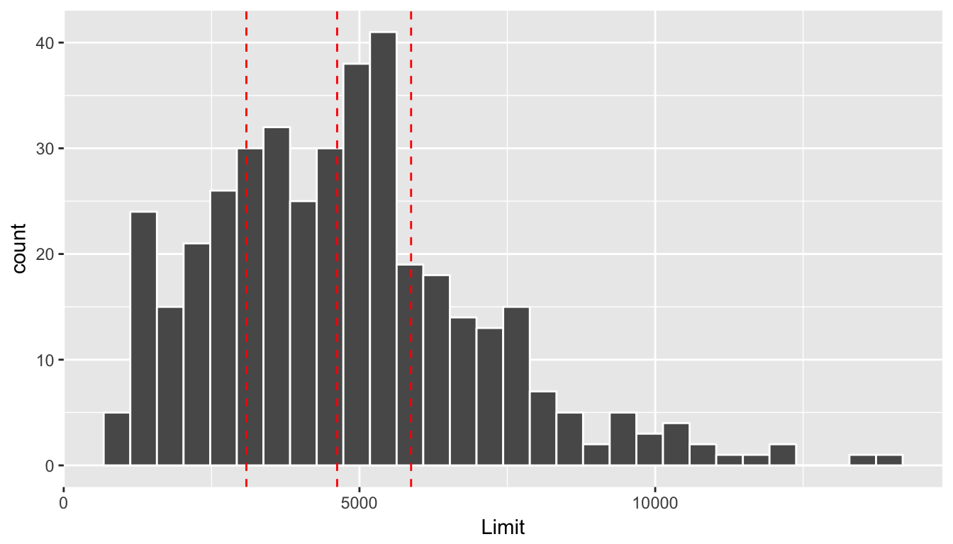
(#fig:credit_limit_quartiles)Histogram of credit limits and quartiles
Let’s now display
- The scatterplot showing the relationship between credit card balance and limit (the right-hand plot of Figure 7.1).
- The scatterplot showing the relationship between credit card balance and limit now with a color aesthetic added corresponding to the credit limit bracket.
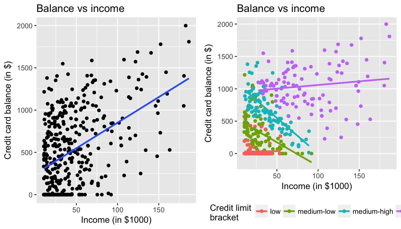
Figure 7.6: Relationship between credit card balance and income for different credit limit brackets
The left-hand plot focuses of the relationship between balance and income in aggregate, but the right-hand plot focuses on the relationship between balance and income broken down by credit limit bracket. Whereas in aggregate there is an overall positive relationship, but when broken down We now see that for the
- low
- medium-low
- medium-high
income bracket groups, the strong positive relationship between credit card balance and income disappears! Only for the high bracket does the relationship stay somewhat positive. In this example credit limit is a confounding variable for credit card balance and income.
7.3.2 Script of R code
An R script file of all R code used in this chapter is available here.