Page last updated at Wednesday, May 24, 2017 15:03:30 PDT
Problem Set 2
Learning Checks LC3.2-LC3.7, LC3.9-LC3.10 from ModernDive
LC3.2
Say the following table are stock prices, how would you make this tidy?
| time | Boeing | Amazon | |
|---|---|---|---|
| 2009-01-01 | $173.55 | $174.90 | $174.34 |
| 2009-01-02 | $172.61 | $171.42 | $170.04 |
| 2009-01-03 | $173.86 | $171.58 | $173.65 |
| 2009-01-04 | $170.77 | $173.89 | $174.87 |
| 2009-01-05 | $174.29 | $170.16 | $172.19 |
Discussion: Boeing, Amazon, and Google are not variables by themselves, but rather levels of another variable stock. The numbers inside the table themselves are prices. Therefore, in its current form, Google corresponds both to the “name of a stock” and the “price of a stock” which violates the rules of tidy data. We can transform the data to make it tidy:
| time | stock | price |
|---|---|---|
| 2009-01-01 | Boeing | $173.55 |
| 2009-01-02 | Boeing | $172.61 |
| 2009-01-03 | Boeing | $173.86 |
| 2009-01-04 | Boeing | $170.77 |
| 2009-01-05 | Boeing | $174.29 |
| 2009-01-01 | Amazon | $174.90 |
| 2009-01-02 | Amazon | $171.42 |
| 2009-01-03 | Amazon | $171.58 |
| 2009-01-04 | Amazon | $173.89 |
| 2009-01-05 | Amazon | $170.16 |
| 2009-01-01 | $174.34 | |
| 2009-01-02 | $170.04 | |
| 2009-01-03 | $173.65 | |
| 2009-01-04 | $174.87 | |
| 2009-01-05 | $172.19 |
LC3.3
What does any ONE row in this flights dataset refer to?
- A. Data on an airline
- B. Data on a flight
- C. Data on an airport
- D. Data on multiple flights
Discussion: The correct answer is B here. The observational unit is flight. All of the variables are measurements/characteristics of a given flight. Each row is an observation of one flight containing data about that flight.
LC3.4
What are some examples in this dataset of categorical variables? What makes them different than quantitative variables?
Discussion: The categorical variables are carrier, tailnum, origin, and dest. The quantitative variables are all of the <int> and <dbl> class variables: year, month, day, dep_time, sched_dep_time, arr_time, sched_arr_time, arr_delay, flight, air_time, distance, hour, and minute. Note that time_hour is labeled as <dttm> corresponding to date-time. This is a special format in R for handling the oddities of dates and times. Note also that dep_time and other similar variables are not labeled as <dttm>, but rather as a number. Think about what problems this might cause in your analyses.
LC3.5
What does int, dbl, and chr mean in the output above? If you need a hint, you might want to run str(flights) instead.
Discussion: These correspond to the class of each variable in R. dbl is the same thing as num and represents numbers with decimal values. int corresponds to integers (whole numbers and their negative opposites (-5, 4, 79, 0, 12342, etc.)). chr corresponds to character values/strings and these are almost always categorical variables. The output of the similar str(flights) is below.
library(nycflights13)
str(flights)
Classes 'tbl_df', 'tbl' and 'data.frame': 336776 obs. of 19 variables:
$ year : int 2013 2013 2013 2013 2013 2013 2013 2013 2013 2013 ...
$ month : int 1 1 1 1 1 1 1 1 1 1 ...
$ day : int 1 1 1 1 1 1 1 1 1 1 ...
$ dep_time : int 517 533 542 544 554 554 555 557 557 558 ...
$ sched_dep_time: int 515 529 540 545 600 558 600 600 600 600 ...
$ dep_delay : num 2 4 2 -1 -6 -4 -5 -3 -3 -2 ...
$ arr_time : int 830 850 923 1004 812 740 913 709 838 753 ...
$ sched_arr_time: int 819 830 850 1022 837 728 854 723 846 745 ...
$ arr_delay : num 11 20 33 -18 -25 12 19 -14 -8 8 ...
$ carrier : chr "UA" "UA" "AA" "B6" ...
$ flight : int 1545 1714 1141 725 461 1696 507 5708 79 301 ...
$ tailnum : chr "N14228" "N24211" "N619AA" "N804JB" ...
$ origin : chr "EWR" "LGA" "JFK" "JFK" ...
$ dest : chr "IAH" "IAH" "MIA" "BQN" ...
$ air_time : num 227 227 160 183 116 150 158 53 140 138 ...
$ distance : num 1400 1416 1089 1576 762 ...
$ hour : num 5 5 5 5 6 5 6 6 6 6 ...
$ minute : num 15 29 40 45 0 58 0 0 0 0 ...
$ time_hour : POSIXct, format: "2013-01-01 05:00:00" "2013-01-01 05:00:00" ...LC3.6
How many different columns are in this dataset?
Discussion:
library(nycflights13)
glimpse(flights)
Observations: 336,776
Variables: 19
$ year <int> 2013, 2013, 2013, 2013, 2013, 2013, 2013, 2013,...
$ month <int> 1, 1, 1, 1, 1, 1, 1, 1, 1, 1, 1, 1, 1, 1, 1, 1,...
$ day <int> 1, 1, 1, 1, 1, 1, 1, 1, 1, 1, 1, 1, 1, 1, 1, 1,...
$ dep_time <int> 517, 533, 542, 544, 554, 554, 555, 557, 557, 55...
$ sched_dep_time <int> 515, 529, 540, 545, 600, 558, 600, 600, 600, 60...
$ dep_delay <dbl> 2, 4, 2, -1, -6, -4, -5, -3, -3, -2, -2, -2, -2...
$ arr_time <int> 830, 850, 923, 1004, 812, 740, 913, 709, 838, 7...
$ sched_arr_time <int> 819, 830, 850, 1022, 837, 728, 854, 723, 846, 7...
$ arr_delay <dbl> 11, 20, 33, -18, -25, 12, 19, -14, -8, 8, -2, -...
$ carrier <chr> "UA", "UA", "AA", "B6", "DL", "UA", "B6", "EV",...
$ flight <int> 1545, 1714, 1141, 725, 461, 1696, 507, 5708, 79...
$ tailnum <chr> "N14228", "N24211", "N619AA", "N804JB", "N668DN...
$ origin <chr> "EWR", "LGA", "JFK", "JFK", "LGA", "EWR", "EWR"...
$ dest <chr> "IAH", "IAH", "MIA", "BQN", "ATL", "ORD", "FLL"...
$ air_time <dbl> 227, 227, 160, 183, 116, 150, 158, 53, 140, 138...
$ distance <dbl> 1400, 1416, 1089, 1576, 762, 719, 1065, 229, 94...
$ hour <dbl> 5, 5, 5, 5, 6, 5, 6, 6, 6, 6, 6, 6, 6, 6, 6, 5,...
$ minute <dbl> 15, 29, 40, 45, 0, 58, 0, 0, 0, 0, 0, 0, 0, 0, ...
$ time_hour <dttm> 2013-01-01 05:00:00, 2013-01-01 05:00:00, 2013...We see above from running glimpse(flights) that the number of variables is 19. In a tidy data frame such as flights, the number of columns corresponds directly to the number of variables so the number of columns is 19. This can also be obtained using the ncol function via ncol(flights).
LC3.7
How many different rows are in this dataset?
Discussion:
We see above from running glimpse(flights) that the number of observations is 336,776. In a tidy data frame such as flights, the number of rows corresponds directly to the number of observations/cases so the number of rows is also 336,776. This can also be obtained using the nrow function via nrow(flights).
LC3.9
What properties of the observational unit do each of lat, lon, alt, tz, dst, and tzone describe for the airports data frame? Note that you may want to use ?airports to get more information or go to the reference manual for the nycflights13 package here.
Discussion:
Using ?airports, we see that lat and lon correspond to the latitude and longitude of the location of the airport. alt is the altitude of the airport in feet. tz is the offset of the airport’s time zone from Greenwich Mean Time. dst corresponds to “Daylight savings time zone” with values of "A" for US DST, "U" for unknown, and "N" for no DST. Lastly, tzone is the name of the time zone in which the airport is located.
LC3.10
Provide the names of variables in a data frame with at least three variables in which one of them is an identification variable and the other two are not.
Discussion: Many answers are appropriate here. The identification variable should correspond to the observational unit of the data frame. Here is one example:
| Student ID | Major | Percentage | Grade |
|---|---|---|---|
| 1000 | Sociology | 95 | A |
| 1001 | Biology | 50 | F |
| 1002 | History | 76 | C |
Problem Set 3
Learning Checks LC3.11-LC3.13 and LC3.15 AND LC4.1-LC4.2, LC4.4, LC4.6-LC4.7, and LC4.10-LC4.13
LC3.11
What are common characteristics of “tidy” datasets?
Discussion: Tidy data sets tend to be in a narrow, long format since they list all possible values of each combination of the different variables. They have one observation per row, one variable per column, one observational unit per data frame, and the entries on the inside of the table are values, each representing the intersection of a particular observation and a particular variable.
LC3.12
What makes “tidy” datasets useful for organizing data?
Discussion: They allow you to easily summarize data across a variable or to plot data and show different relationships across other variables. They are incredibly useful in looking for multivariate relationships (more than two variables) in data. You’ll see more of this as the semester goes along.
LC3.13
How many variables are presented in the table below? What does each row correspond to? (Hint: You may not be able to answer both of these questions immediately but take your best guess.)
| students | faculty |
|---|---|
| 4 | 2 |
| 6 | 3 |
Discussion: This is an incredibly difficult problem to figure out. You can guess that students and faculty should actually be levels of a variable called something like type or role. The numbers inside the table represent counts of some sort, so there may be at least two other variables floating around in there.
LC3.15
The actual data presented in LC3.13 is given below in tidy data format:
| role | Sociology? | Type of School |
|---|---|---|
| student | TRUE | Public |
| student | TRUE | Public |
| student | TRUE | Public |
| student | TRUE | Public |
| student | FALSE | Public |
| student | FALSE | Public |
| student | FALSE | Private |
| student | FALSE | Private |
| student | FALSE | Private |
| student | FALSE | Private |
| faculty | TRUE | Public |
| faculty | TRUE | Public |
| faculty | FALSE | Public |
| faculty | FALSE | Private |
| faculty | FALSE | Private |
- What does each row correspond to?
- What are the different variables in this data frame?
- The
Sociology?variable is known as a logical variable. What types of values does a logical variable take on?
Discussion:
- Each row corresponds to a particular observation (an instance of the observational unit). In this case, each row corresponds to a particular person, either a faculty member or a student.
- The different variables are
role,Sociology?, andType of School. - Logical variables take on the values of
TRUEorFALSE.
LC4.1
Take a look at both the flights and all_alaska_flights data frames by running View(flights) and View(all_alaska_flights) in the console. In what respect do these data frames differ?
Discussion: Recall that you don’t have the ability to run View in DataCamp and we aren’t using RStudio just yet. You can find interactive versions of both data frames here though.
The only difference between these data frames is that flights contains information about 2013 NYC flights from all carriers and all_alaska_flights only contains information about flights using Alaskan Airlines.
LC4.2
What are some practical reasons why dep_delay and arr_delay have a positive relationship?
Discussion:
Flights that are late in leaving the origin airport will almost surely be late in arriving at the destination airport. Further, a flight that is delayed 15 minutes on departure will probably be delayed around 15 minutes on arrival. Pilots are able to make up some time in the air sometimes, but a positive relationship is clear here. As dep_delay increases, arr_delay also increases.
LC4.6
Create a new scatter-plot using different variables in the all_alaska_flights data frame by modifying the example above. (Run your code in the sandbox in DataCamp and then write your code on your paper. Discuss what findings you have when looking at the plot. Remember that scatter-plots only work when analyzing the relationship between two numerical variables!)
Discussion:
There are many potential plots you could create here. Here is one example:
library(nycflights13)
library(ggplot2)
all_alaska_flights <- flights %>% filter(carrier == "AS")
ggplot(data = all_alaska_flights, mapping = aes(x = air_time, y = distance)) +
  geom_point()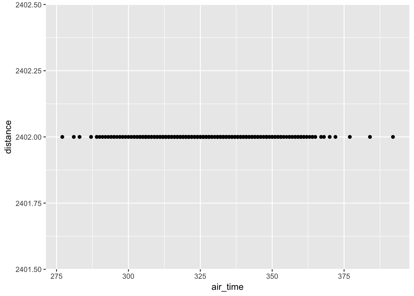
This might initially look like an error but Alaskan Airlines online flies to Seattle from New York City. Therefore, all of the distance values are 2402. We can see that there was quite a bit of variability in terms of air_time though.
LC4.7
Why is setting the alpha argument value useful with scatter-plots? What further information does it give you that a regular scatter-plot cannot?
Discussion:
The alpha argument allows for the setting of the transparency of the points. This allows you to see when many points are over-lapping and to identify over-plotting in your scatter-plot.
LC4.10
The weather data is recorded hourly. Why does the time_hour variable correctly identify the hour of the measurement whereas the hour variable does not?
Discussion:
The time_hour variable gives the precise hour on a given day. The hour variable is just an integer value from 0 to 23 so without other information, hour only gives the hour of a particular day.
LC4.11
Why should line-graphs be avoided when there is not a clear ordering of the horizontal axis?
Discussion:
Line-graphs only show trends in the data and are best used with time as the explanatory variable on the horizontal axis. When there is no clear ordering of the horizontal axis, one could deceive the reader into thinking a pattern/trend exists when, in fact, one does not.
LC4.12
Why are line-graphs frequently used when time is the explanatory variable?
Discussion:
Time on the horizontal axis and a single value for each time point provides a simple way to identify a trend in the variable. It allows for one to easily answer questions such as “Is the response variable increasing over time?”, “Where are there peaks and valleys in the response variable?”, etc.
LC4.13
Plot a time series of a variable other than temp for Newark Airport in the first 15 days of January 2013. (Run your code in the sandbox in DataCamp and then write your code on your paper. Discuss what findings you have when looking at the plot. Remember that scatter-plots only work when analyzing the relationship between two numerical variables!)
Discussion:
There are many potential answers for this question. Here is one answer:
library(nycflights13)
library(ggplot2)
early_january_weather <- weather %>%
  filter(origin == "EWR" & month == 1 & day <= 15)
ggplot(data = early_january_weather, mapping = aes(x = time_hour, y = wind_gust)) +
  geom_line()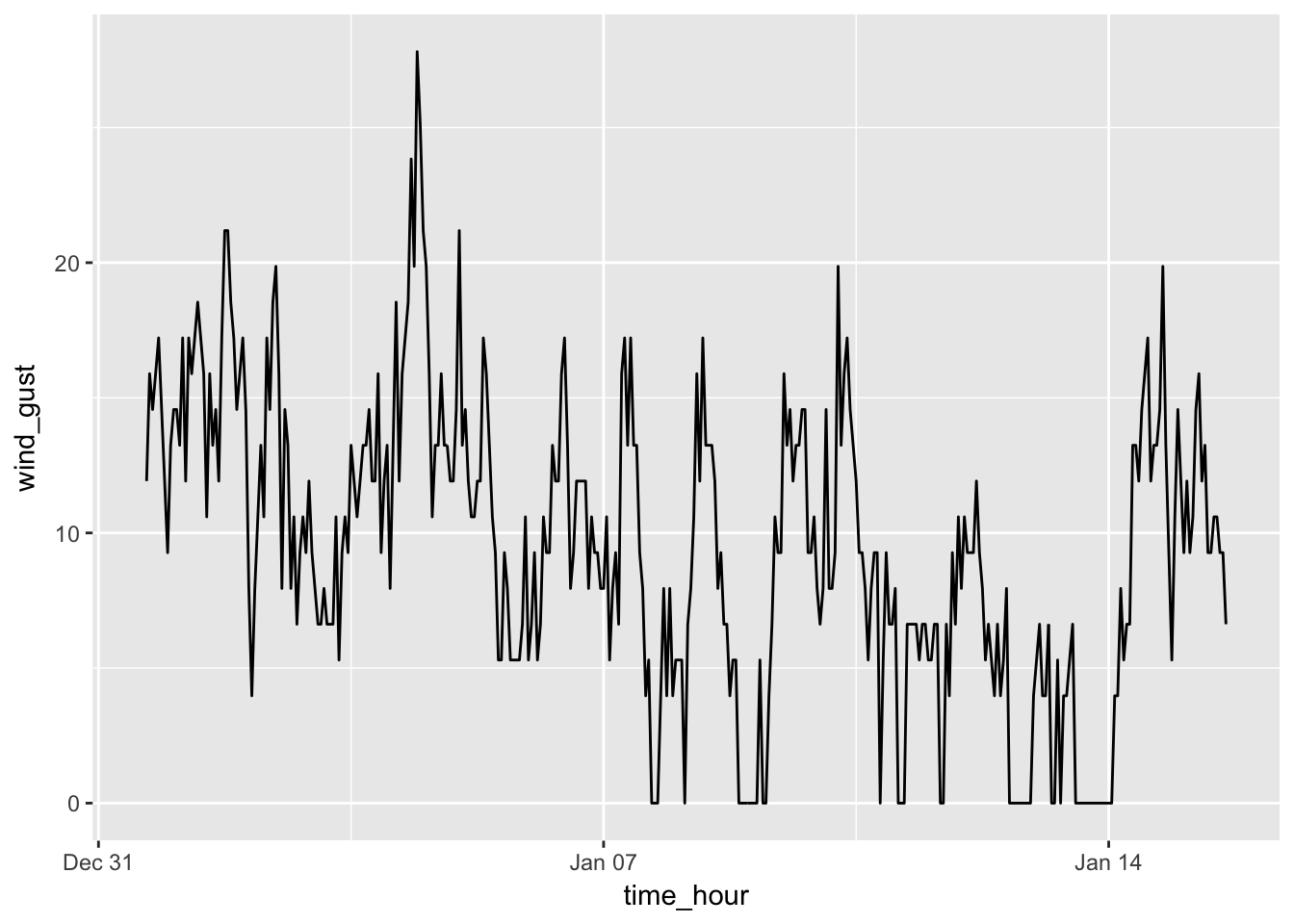
What immediately stands out in this plot are the days with no wind gusts at all and values of 0. There appears to be only one wind gust over 25 mpg around January 2nd or 3rd.
Problem Set 4
Learning Checks LC4.14, LC4.16, LC4.18, LC4.19, LC4.21-LC4.28, LC4.30, LC4.33-LC4.34, LC4.36-LC4.37
LC4.14
What does changing the number of bins from 30 to 60 tell us about the distribution of temperatures?
Discussion:
Increasing the number of bins allows for us to see the distribution of temperatures in finer detail.
LC4.16
What would you guess is the “center” value in this distribution? Why did you make that choice?
Discussion:
There is no exact answer here at this point in the course. I wanted you to think about what the balancing point would be having half the values before it and half after it. This falls somewhere between 50 and 55.
LC4.18
What other things do you notice about the faceted plot above? How does a faceted plot help us see relationships between two variables?
Discussion:
The faceted plot allows us to better see the range of temperatures for each month. In general, a faceted plot can be helpful in seeing trends in one variable compared to another.
LC4.19
What do the numbers 1-12 correspond to in the plot above? What about 25, 50, 75, 100?
Discussion:
The numbers 1-12 correspond to months in the year 2013. The nubmers 25, 50, 75, and 100 correspond to Fahrenheit temperatures.
LC4.21
Does the temp variable in the weather data set have a lot of variability? Why do you say that?
Discussion:
New York City does have a broad range of temperatures throughout the year. We see that summer months tend to be much warmer than winter months, so, yes, temp in weather does have a lot of variability.
LC4.22
What does the dot at the bottom of the plot for May correspond to? Explain what might have occurred in May to produce this point.
Discussion:
The dot at the bottom of the plot for May corresponds to a low outlier. This could have been a very cold hour, but since no other hours have that cold of a temperature it is more than likely a measurement error.
LC4.23
Which months have the highest variability in temperature? What reasons do you think this is?
Discussion:
The spring and fall months have the highest variability in temperature. These months tend to have cold mornings and warmer high temperatures.
LC4.24
We looked at the distribution of a continuous variable over a categorical variable here with this boxplot. Why can’t we look at the distribution of one continuous variable over the distribution of another continuous variable? Say, temperature across pressure, for example?
Discussion:
A boxplot works well because you can look at the distribution of the continuous variable across the different (often only a few) levels of the categorical variable. A continuous explanatory variable will have many, many levels making the boxplot very hard to read and interpret.
LC4.25
Boxplots provide a simple way to identify outliers. Why may outliers be easier to identify when looking at a boxplot instead of a faceted histogram?
Discussion:
A faceted histogram shows the height of the bin and if outliers are all alone they will appear as having a bin of height close to zero, which is almost indistinguishable from zero. Therefore, they are more likely to be missed when looking at a faceted histogram. A boxplot will clearly show them.
LC4.26
Why are histograms inappropriate for visualizing categorical variables?
Discussion:
Histograms show how many values fall into different bins of a numerical variable that falls on a continuum. (This is one reason why the bins are touching.) Since a categorical variable does not fall on a continuum, histograms are inappropriate.
LC4.27
What is the difference between histograms and barplots?
Discussion:
The bins touch on a histogram and the bars/bins on a barplot do not. Histograms show the distribution of a continuous variable whereas barplots show the distribution of a categorical variable.
LC4.28
How many Envoy Air flights departed NYC in 2013?
Discussion:
Since Envoy Air corresponds to carrier code MQ via the airports data frame, we see that 26,397 flights departed New York City in 2013.
LC4.30
Why should pie charts be avoided and replaced by barplots?
Discussion:
Pie charts rely on us being able to tell the different between different slices of the pie in terms of the percentage of area covered. Our eyes and brains are not naturally good at this task. We are extremely good at determining the height of bars and comparing them across different groups as a barplot shows.
LC4.33
What can you say, if anything, about the relationship between airline and airport in NYC in 2013 in regards to the number of departing flights?
Discussion:
Certain airlines tend to depart from one airport far more than the other two airports. For example, ExpressJet Airlines has nearly all of its flights from Newark.
LC4.34
Why might the side-by-side barplot be preferable to a stacked barplot in this case?
Discussion:
It is harder to compare the frequency of flights for LaGuardia or JFK when looking at a stacked barplot since they are already stacked on top of Newark.
LC4.36
Why is the faceted barplot preferred to the side-by-side and stacked barplots in this case?
Discussion:
A faceted barplot allows for comparisons to be made more easily across both airports AND airlines.
LC4.37
What information about the different carriers at different airports is more easily seen in the faceted barplot?
Discussion:
The faceted barplot provides an easier way to see the airlines that have no departing flights and also many flights from each airport.
Problem Set 6
Learning Checks LC5.1-LC5.2, LC5.4-LC5.5, LC5.7, LC5.9-LC5.14
LC5.1
What’s another way using ! we could filter only the rows that are not going to Burlington, VT nor Seattle, WA in the flights data frame? Test this out using the code above.
Discussion:
This question refers to
library(dplyr)
library(nycflights13)
not_BTV_SEA <- flights %>%
  filter(!(dest == "BTV" | dest == "SEA"))
in choosing only the rows of flights that don’t go to Burlington, Vermont or Seattle, Washington. Another way to do this is to choose those that don’t go to Burlington AND those that don’t go to Seattle:
not_BTV_SEA2 <- flights %>%
  filter(!(dest == "BTV"), !(dest == "SEA"))
We can use the identical function to show that these objects are the same:
identical(not_BTV_SEA, not_BTV_SEA2)[1] TRUELC5.2
Say a doctor is studying the effect of smoking on lung cancer of a large number of patients who have records measured at five year intervals. He notices that a large number of patients have missing data points because the patient has died, so he chooses to ignore these patients in his analysis. What is wrong with this doctor’s approach?
Discussion:
By ignoring these data points, he is creating bias in the data. One of the major things the study is probably trying to determine is the role of smoking on lung cancer and whether or not patients had died. The point of this exercise is to understand that just applying na.rm = TRUE into your analysis to remove missing values and warnings should only be done with caution.
LC5.4
Why doesn’t the following code work? You may want to run the code line by line instead of all at once. In other words, run summary_temp <- weather %>% summarize(mean = mean(temp, na.rm = TRUE)) first.
summary_temp <- weather %>%
  summarize(mean = mean(temp, na.rm = TRUE)) %>%
summarize(std_dev = sd(temp, na.rm = TRUE))Discussion:
The data frame created via summary_temp <- weather %>% summarize(mean = mean(temp, na.rm = TRUE)) will only contain one column with one value corresponding to the overall mean temperature. Thus, we can’t also calculate the standard deviation of temp since temp no longer exists in this aggregated data frame. The correct code to calculate the mean and standard deviation is
summary_temp <- weather %>%
  summarize(mean = mean(temp, na.rm = TRUE),
            std_dev = sd(temp, na.rm = TRUE))
summary_temp
# A tibble: 1 x 2
mean std_dev
<dbl> <dbl>
1 55.20351 17.78212LC5.5
Recall from Chapter 4 when we looked at plots of temperatures by months in NYC. What does the standard deviation column in the summary_monthly_temp data frame tell us about temperatures in New York City throughout the year?
Discussion:
This is referencing
library(knitr) # for kable function
summary_monthly_temp <- weather %>%
  group_by(month) %>%
  summarize(mean = mean(temp, na.rm = TRUE),
            std_dev = sd(temp, na.rm = TRUE))
kable(summary_monthly_temp)| month | mean | std_dev |
|---|---|---|
| 1 | 35.64127 | 10.185459 |
| 2 | 34.15454 | 6.940228 |
| 3 | 39.81404 | 6.224948 |
| 4 | 51.67094 | 8.785250 |
| 5 | 61.59185 | 9.608687 |
| 6 | 72.14500 | 7.603357 |
| 7 | 80.00967 | 7.147631 |
| 8 | 74.40495 | 5.171365 |
| 9 | 67.42582 | 8.475824 |
| 10 | 60.03305 | 8.829652 |
| 11 | 45.10893 | 10.502249 |
| 12 | 38.36811 | 9.940822 |
We can see that the variability in temperature is highest in January and November since the standard deviation is highest in those months. June, July, and August have the lowest variability followed by February and March. This corresponds to temperature being roughly the same value all throughout those months whereas there is a lot of variability in the temperature in January and November.
LC5.7
Recreate by_monthly_origin, but instead of grouping via group_by(origin, month), group variables in a different order group_by(month, origin). What differs in the resulting data set?
Discussion:
This is referencing
by_monthly_origin <- flights %>%
  group_by(origin, month) %>%
  summarize(count = n())
kable(by_monthly_origin)| origin | month | count |
|---|---|---|
| EWR | 1 | 9893 |
| EWR | 2 | 9107 |
| EWR | 3 | 10420 |
| EWR | 4 | 10531 |
| EWR | 5 | 10592 |
| EWR | 6 | 10175 |
| EWR | 7 | 10475 |
| EWR | 8 | 10359 |
| EWR | 9 | 9550 |
| EWR | 10 | 10104 |
| EWR | 11 | 9707 |
| EWR | 12 | 9922 |
| JFK | 1 | 9161 |
| JFK | 2 | 8421 |
| JFK | 3 | 9697 |
| JFK | 4 | 9218 |
| JFK | 5 | 9397 |
| JFK | 6 | 9472 |
| JFK | 7 | 10023 |
| JFK | 8 | 9983 |
| JFK | 9 | 8908 |
| JFK | 10 | 9143 |
| JFK | 11 | 8710 |
| JFK | 12 | 9146 |
| LGA | 1 | 7950 |
| LGA | 2 | 7423 |
| LGA | 3 | 8717 |
| LGA | 4 | 8581 |
| LGA | 5 | 8807 |
| LGA | 6 | 8596 |
| LGA | 7 | 8927 |
| LGA | 8 | 8985 |
| LGA | 9 | 9116 |
| LGA | 10 | 9642 |
| LGA | 11 | 8851 |
| LGA | 12 | 9067 |
by_origin_month <- flights %>%
  group_by(month, origin) %>%
  summarize(count = n())
kable(by_origin_month)| month | origin | count |
|---|---|---|
| 1 | EWR | 9893 |
| 1 | JFK | 9161 |
| 1 | LGA | 7950 |
| 2 | EWR | 9107 |
| 2 | JFK | 8421 |
| 2 | LGA | 7423 |
| 3 | EWR | 10420 |
| 3 | JFK | 9697 |
| 3 | LGA | 8717 |
| 4 | EWR | 10531 |
| 4 | JFK | 9218 |
| 4 | LGA | 8581 |
| 5 | EWR | 10592 |
| 5 | JFK | 9397 |
| 5 | LGA | 8807 |
| 6 | EWR | 10175 |
| 6 | JFK | 9472 |
| 6 | LGA | 8596 |
| 7 | EWR | 10475 |
| 7 | JFK | 10023 |
| 7 | LGA | 8927 |
| 8 | EWR | 10359 |
| 8 | JFK | 9983 |
| 8 | LGA | 8985 |
| 9 | EWR | 9550 |
| 9 | JFK | 8908 |
| 9 | LGA | 9116 |
| 10 | EWR | 10104 |
| 10 | JFK | 9143 |
| 10 | LGA | 9642 |
| 11 | EWR | 9707 |
| 11 | JFK | 8710 |
| 11 | LGA | 8851 |
| 12 | EWR | 9922 |
| 12 | JFK | 9146 |
| 12 | LGA | 9067 |
This grouping orders first by month and then by origin whereas the previous grouping orders by origin and then by month. This is a simple way to sort data but you should be careful to make sure you are grouping in the appropriate order.
LC5.9
How does the filter operation differ from a group_by followed by a summarize?
Discussion:
filter only reduces the total number of rows in the original data frame to only choose those that match a given set of conditions. group_by with summarize creates an aggregated data frame that fundamentally is of a different size with different variables than the original data frame.
LC5.10
What do positive values of the gain variable in flights correspond to? What about negative values? And what about a zero value?
Discussion:
Observing how gain was defined will give us a better understanding:
flights <- flights %>%
  mutate(gain = arr_delay - dep_delay)
We can see that this value will be positive when arr_delay is larger than dep_delay and negative when dep_delay is larger than arr_delay. A zero value corresponds to no gain on the flight. This means that the pilot was not able to make up any time on the flight. A positive gain means that the pilot was NOT able to make up time during the flight since the arrival delay is more than the departure delay. A negative gain means that the pilot was able to make up time during the flight.
LC5.11
Could we create the dep_delay and arr_delay columns by simply subtracting dep_time from sched_dep_time and similarly for arrivals? Try the code out and explain any differences between the result and what actually appears in flights.
Discussion:
We use the mutate() function to create new variables. We will also select only the two newly created variables and dep_delay and arr_delay. Lastly, we include dep_time and sched_dep_time to see if the subtractions are correct and display the first 15 rows.
flights_new <- flights %>%
  mutate(my_dep_delay = dep_time - sched_dep_time,
         my_arr_delay = arr_time - sched_arr_time) %>%
  select(dep_time, sched_dep_time, my_dep_delay, dep_delay, my_arr_delay, arr_delay)
head(flights_new, 15)
# A tibble: 15 x 6
dep_time sched_dep_time my_dep_delay dep_delay my_arr_delay arr_delay
<int> <int> <int> <dbl> <int> <dbl>
1 517 515 2 2 11 11
2 533 529 4 4 20 20
3 542 540 2 2 73 33
4 544 545 -1 -1 -18 -18
5 554 600 -46 -6 -25 -25
6 554 558 -4 -4 12 12
7 555 600 -45 -5 59 19
8 557 600 -43 -3 -14 -14
9 557 600 -43 -3 -8 -8
10 558 600 -42 -2 8 8
11 558 600 -42 -2 -2 -2
12 558 600 -42 -2 -3 -3
13 558 600 -42 -2 7 7
14 558 600 -42 -2 -14 -14
15 559 600 -41 -1 31 31We see that the first four rows look OK, but then some problems occur. my_dep_delay gives a value of -46 when the true dep_delay is -6. You can see that this is due shifting to a new hour. Since 600 - 554 = -46, it isn’t as simple as just subtracting the two rows to get the delay. You also need to account for their only being 60 minutes in an hour not 100.
LC5.12
What can we say about the distribution of gain? Describe it in a few sentences using the plot and the gain_summary data frame values.
Discussion:
Here are the plot and summary values:
library(ggplot2)
ggplot(data = flights, mapping = aes(x = gain)) +
  geom_histogram(color = "white", bins = 20)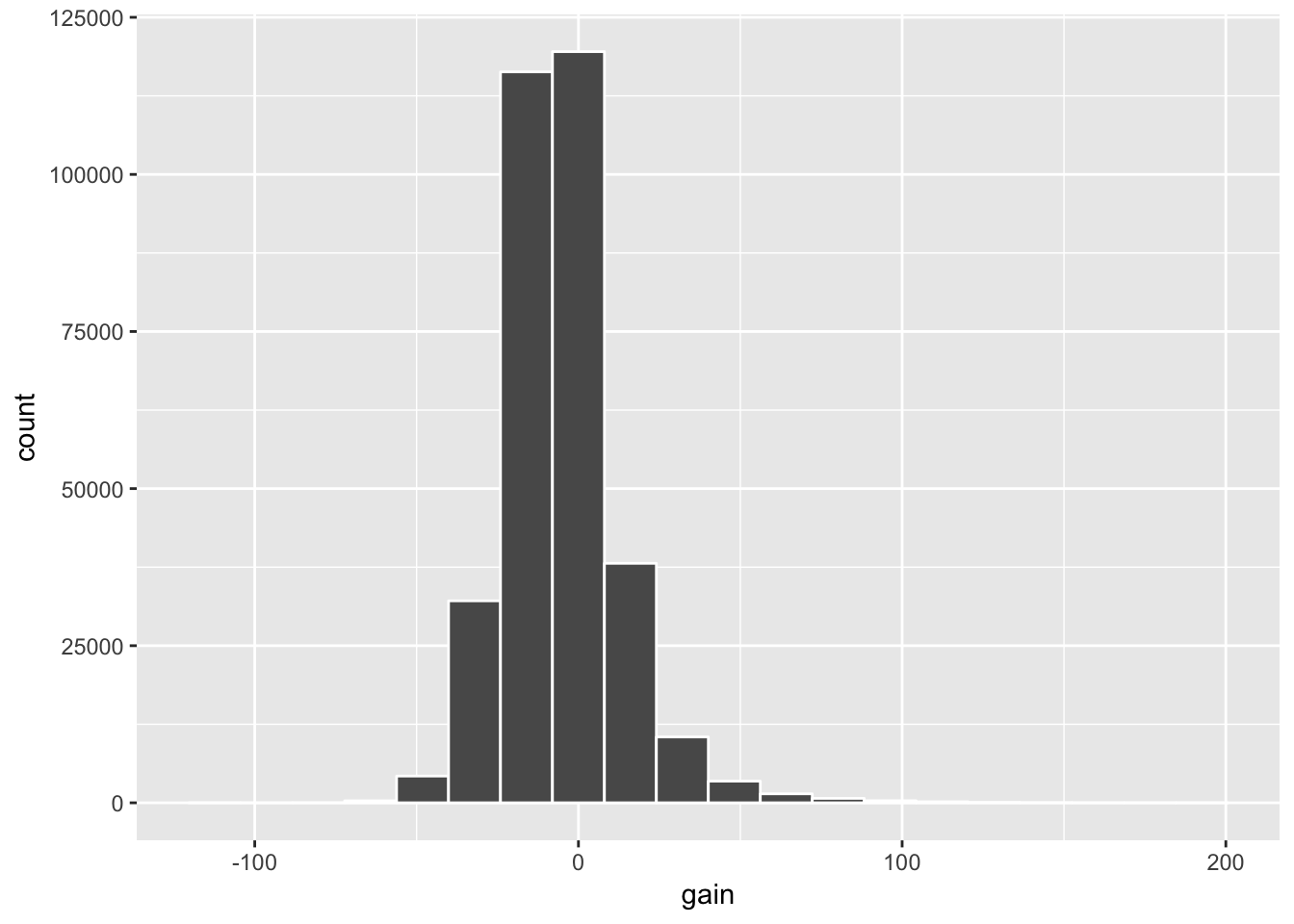
gain_summary <- flights %>%
  summarize(
    min = min(gain, na.rm = TRUE),
    q1 = quantile(gain, 0.25, na.rm = TRUE),
    median = quantile(gain, 0.5, na.rm = TRUE),
    q3 = quantile(gain, 0.75, na.rm = TRUE),
    max = max(gain, na.rm = TRUE),
    mean = mean(gain, na.rm = TRUE),
    sd = sd(gain, na.rm = TRUE),
    missing = sum(is.na(gain))
  )
kable(gain_summary)| min | q1 | median | q3 | max | mean | sd | missing |
|---|---|---|---|---|---|---|---|
| -109 | -17 | -7 | 3 | 196 | -5.659779 | 18.04365 | 9430 |
We see from the plot that the distribution of gain is roughly symmetric, but with some skew to the right for some very long delays. The mean and median values are both negative which means that we can expect to arrive a few minutes earlier than expected if our flight departs late from NYC. The standard deviation value tells us that we can expect any given flight to be about 18 minutes away from the mean value of -5.66 minutes.
LC5.13
Looking at Figure 5.7, when joining flights and weather (or, in other words, matching the hourly weather values with each flight), why do we need to join by all of year, month, day, hour, and origin, and not just hour?
Discussion:
The hour variable does not contain enough information for any given row in flights or weather. It just gives a single numeric value. Flights depart during an hour of a day in a month in a year from an origin airport. Weather is also recorded at these same variables.
LC5.14
What surprises you about the top 10 destinations from NYC in 2013?
Discussion:
This is referring to
freq_dest <- flights %>%
  group_by(dest) %>%
  summarize(num_flights = n()) %>%
  arrange(desc(num_flights))
freq_dest
# A tibble: 105 x 2
dest num_flights
<chr> <int>
1 ORD 17283
2 ATL 17215
3 LAX 16174
4 BOS 15508
5 MCO 14082
6 CLT 14064
7 SFO 13331
8 FLL 12055
9 MIA 11728
10 DCA 9705
# ... with 95 more rowsAnswers will vary here. One thing that stands out is that the most flights go to Chicago (ORD) and Atlanta (ATL). These airports are not very close to New York City. Both of these airports are major hubs for airlines though which is likely driving them being at the top of the list as well as Los Angeles (LAX) and Boston (BOS).
Problem Set 10
Learning Checks LC6.1, LC6.3, LC6.9, LC6.11, LC6.13, LC6.15
LC6.1
Explain in your own words how tasting soup relates to the concepts of sampling covered here.
Discussion:
The entire pot of soup is the population. A sample would be a bowl of soup from that pot. Sampling is the process of selecting a bowl from the pot of soup. If the pot is stirred and the scoop is done at random, we can generalize to the entire pot of soup any characteristics we notice in the bowl of soup. If the pot is not stirred and there is bias in the selection of the sample (say if all carrots are chosen), we cannot generalize to the whole pot of soup but only to the sample selected.
LC6.3
Why isn’t our population all bowls of soup? All bowls of Indian chicken soup?
Discussion:
All bowls of Indian chicken soup (and thus all bowls of soup) may not have the same characteristics as this particular bowl of soup.
LC6.9
Does this random sample of height represent the population height variable well? Explain why or why not in a couple of sentences.
Discussion:
This question is referring to the following population plot and sample plot (with red fill):
library(okcupiddata)
library(dplyr)
library(ggplot2)
library(mosaic)
profiles_subset <- profiles %>% filter(between(height, 55, 85))
ggplot(data = profiles_subset, mapping = aes(x = height)) +
  geom_histogram(bins = 20, color = "white")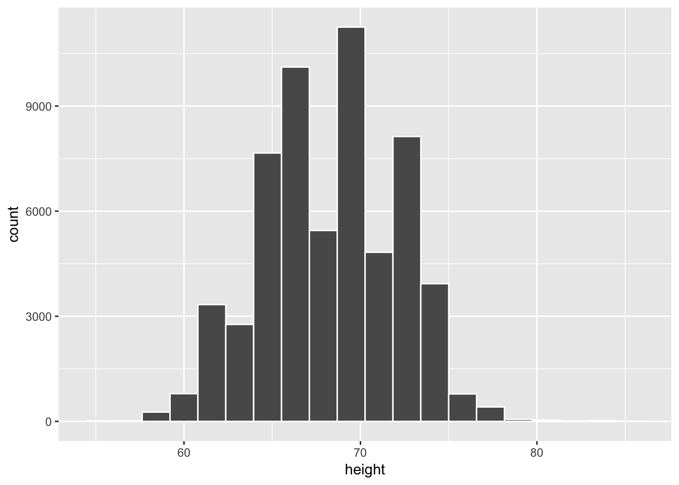
set.seed(2017)
profiles_sample1 <- profiles_subset %>%
  resample(size = 100, replace = FALSE)
ggplot(data = profiles_sample1, mapping = aes(x = height)) +
  geom_histogram(bins = 20, color = "white", fill = "red") +
  coord_cartesian(xlim = c(55, 85))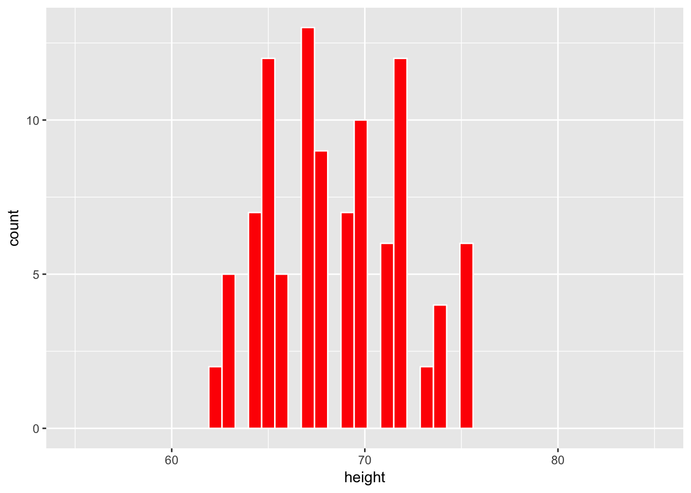
The overall shape of the sample is similar to the overall shape of the population. It also covers roughly the same values as the population covers in its histogram.
LC6.11
Why is random sampling so important here to create a distribution of sample means that provide a range of plausible values for the population mean height?
Discussion:
Without random sampling we have the potential for bias in our samples. If these samples are biased, when we calculate the mean of each sample we will have biased mean readings that will deviate far from what the actual population mean is. Random sampling ensures that bias is as close to eliminated as possible so we can be confident that our process would lead to a better estimation procedures of the population parameter.
LC6.13
What is our observed statistic?
Discussion:
This question refers to the “Lady Tasting Tea” experiment. Here it is the proportion of times the woman was able to correctly identify whether the tea or the milk was added first. The value here is 9/10 = 0.9.
LC6.15
How could we test to see whether the person is just guessing or if they have some special talent of identifying milk before tea or vice-versa?
Discussion:
We would begin by setting out 10 cups. We then use a coin to randomly assign to each cup whether we will add milk first or second. For our purposes, we will say that “heads” corresponds to milk first. We then ask the lady to taste each cup and identify whether or not milk was added first or second. It is important between each cup tasting for her to cleanse her palette so that each trial is independent of the others. If she correctly identifies a large proportion of the 10 cups correctly, we have reason to believe she may have a special talent.
This can be verified by performing many different coin flip simulations assuming a fair coin in sets of 10 and counting the number of heads. We can then see where the number we observed her getting correct falls on this distribution. If it falls out in the right tail, we can assume our initial assumption that she was just guessing may not be correct. If the observed number falls closer to the center of the distribution, we do not have evidence to go against or original assumption that she is just guessing.
Problem Set 11
Learning Checks LC7.1 - LC7.5
LC7.1
Could we make the same type of immediate conclusion that SFO had a statistically greater air_time if, say, its corresponding standard deviation was 200 minutes? What about 100 minutes? Explain.
Discussion:
If SFO had a standard deviation of 100 minutes, the boxplots would likely still not overlap so we could have the same immediate conclusion. With a standard deviation of 200 minutes though, the data would be much more variable and likely there would be some overlap between the boxplot for SFO and BOS.
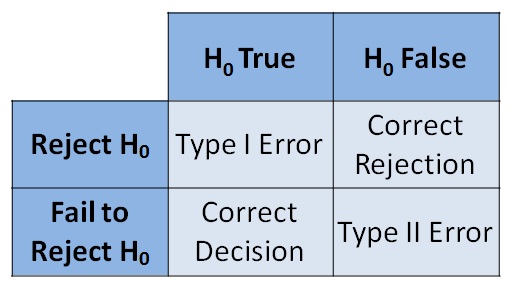
LC7.2
Reproduce the table above about errors, but for a hypothesis test, instead of the one provided for a criminal trial.
Discussion:
The original table for a criminal trial is below.
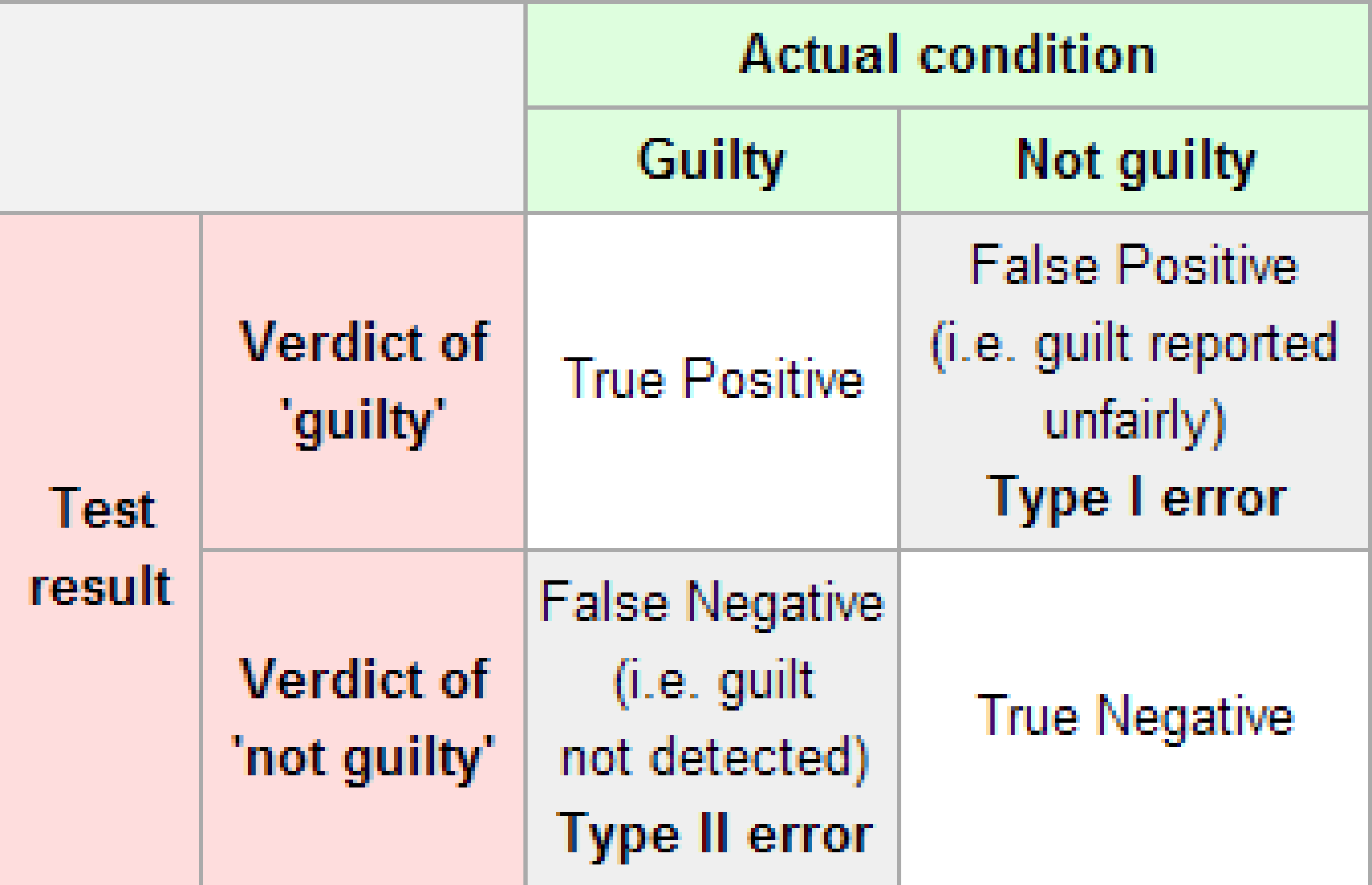
The corresponding table for a hypothesis test follows.
LC7.3
What is wrong about saying “The defendant is innocent.” based on the US system of criminal trials?
Discussion:
You can never prove non-existence. You can only have evidence for or against a claim. Therefore, it is more appropriate and correct to say “The defendant is not guilty.” or better yet “There is not evidence to conclude that the defendant is guilty.”
LC7.4
What is the purpose of hypothesis testing?
Discussion:
Much like a criminal trial, hypothesis testing is used to see if the sample collected brings evidence forth against or in favor of the null hypothesis. If the sample and its observed statistic deviates far from what we expect to be true in the null hypothesis, we reject the original assumption in favor of the alternative hypothesis. The alternative hypothesis usually represents what the researchers are interested in testing or a claim that has been made.
LC7.5
What are some flaws with hypothesis testing? How could we alleviate them?
Discussion:
The biggest flaw with hypothesis testing is the fact that it only has two competing hypothesis and a choice must be made one way or the other based on the data. When we reject the null hypothesis, we often want to also know “But how far away might we expect the mean of one group to be from the other?” or similar questions. Much like a criminal trial, we aren’t necessarily sure of just “how guilty” a person may be and type I and type II errors can be made in criminal trials and hypothesis tests. Unfortunately, this is something built in to the process of both. The dichotomy is alleviated some by using confidence intervals to estimate the difference as is discussed in Chapter 8 of ModernDive.
Problem Set 13
- Modify the code I provided in the slides in an R script and explain your results to the following problem:
Repeat the sampling, bootstrapping, and confidence interval R code steps above, but this time using the median and the IQR instead of the mean and standard deviation.
- Provide your modified code and explain what each line of code is doing.
- What changes in the results of the analysis?
- Do we get the same result as with the mean and standard deviation?
Discussion:
Copying the code from the slides, we begin with installing the haven package as shown on the slide here.
install.packages("haven")We then load the package via the library function:
library(haven)We can now read in the data as a data frame with the name global13_full stored in the SPSS file format downloaded from my webpage:
url <- "https://ismayc.github.io/global13sdss_0.sav"
global13_full <- read_sav(url)
Next, we choose only a couple columns of interest to us:
global13 <- global13_full %>% select(country, FEMALEOFFICE)We proceed to plot the distribution of all percentage of females in national office after loading the ggplot2 package. (Note that nothing has changed yet in terms of mean and standard deviation being replaced with median and interquartile range yet. This code is exactly the same so far as what was done in class.)
library(ggplot2)
ggplot(data = global13, mapping = aes(x = FEMALEOFFICE)) +
  geom_histogram(color = "white", bins = 15)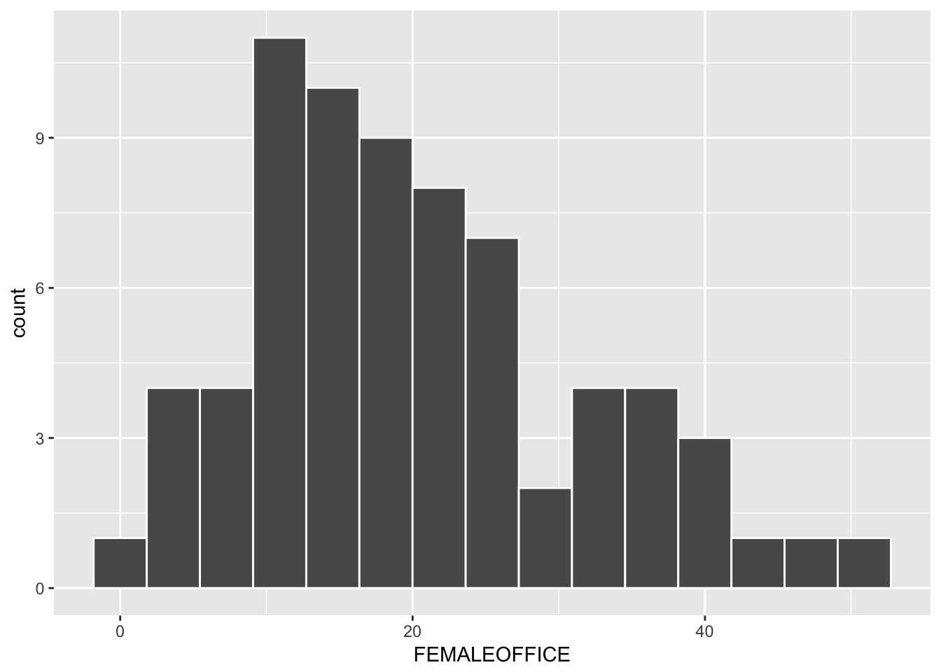
We begin by selecting a single sample of size 25 from the population and calculating its median. We will set the seed to the random number generator to be 2017. (If you didn’t choose this same initial seed, you will obtain slightly different results in what follows.)
sample1 <- global13 %>% resample(size = 25, replace = FALSE)
(median_s1_f <- sample1 %>% summarize(median_f = median(FEMALEOFFICE)))
# A tibble: 1 x 1
median_f
<dbl>
1 21.3Here we create a sample of size 25 without replacement to simulate the process of selecting 25 countries at random from the pool of all countries in our population. Then we calculate the median of the percentage of females in national office for those 25 selected countries and repeat this process 5000 times. The sample_medians data frame stores these 5000 sample medians.
sample_medians <- do(5000) *
  global13 %>% resample(size = 25, replace = FALSE) %>%
  summarize(median_f = median(FEMALEOFFICE))
We next use ggplot2 to plot a histogram of the distribution of sample medians. This is also known of the sampling distribution of the median.
ggplot(data = sample_medians, mapping = aes(x = median_f)) +
  geom_histogram(color = "white", bins = 15)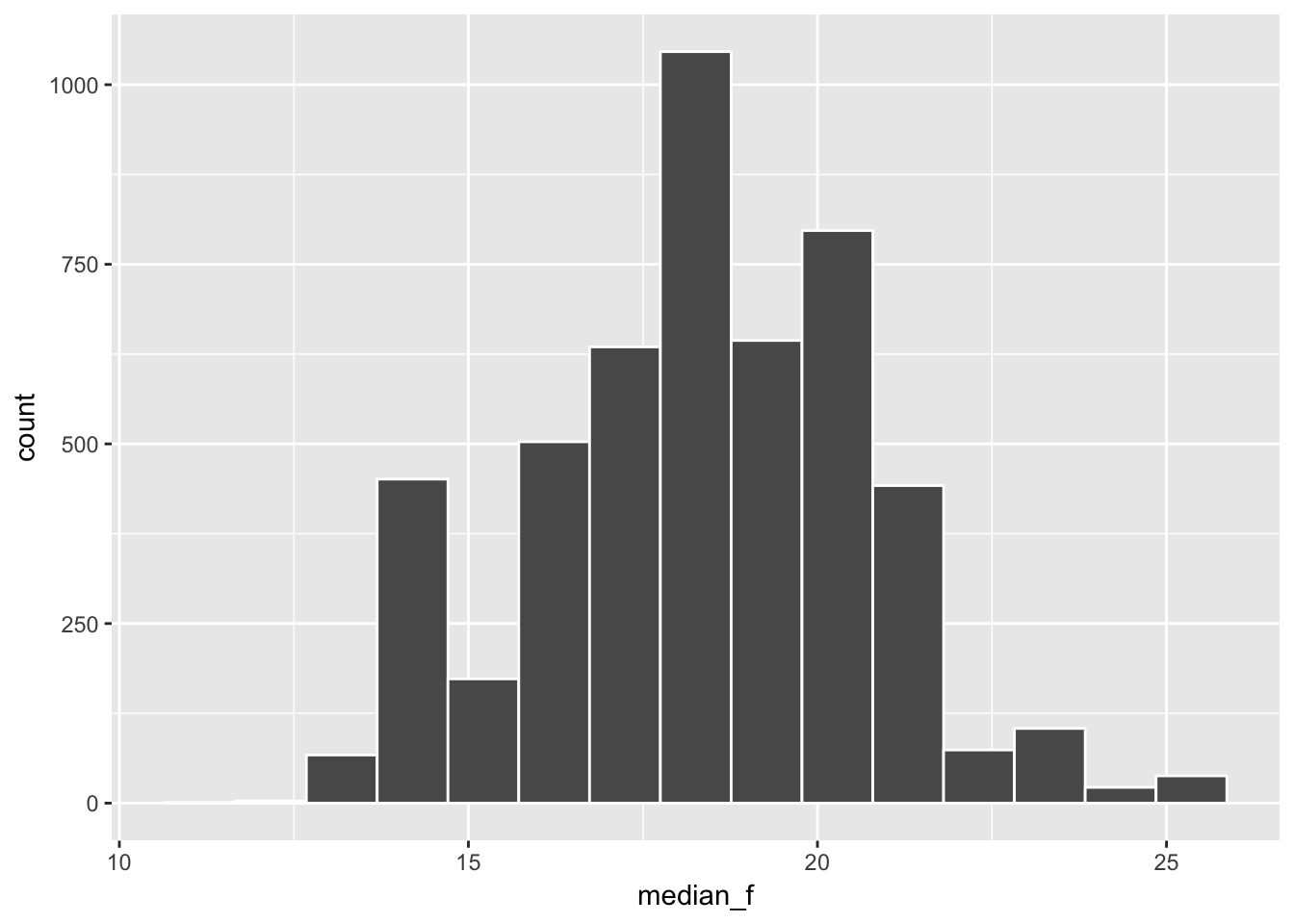
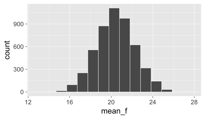
Note: We see that the distribution of the sample medians looks much different than the nice bell-shaped pattern we saw with the sampling distribution of the means as seen below:
The median of the sample medians provides a good estimate for the population median as seen below by computing both:
sample_medians %>% summarize(median_samp_dist = median(median_f)) median_samp_dist
1 18.5global13 %>% summarize(pop_median = median(FEMALEOFFICE))# A tibble: 1 x 1
pop_median
<dbl>
1 18.55We next calculate the interquartile range (IQR) of the sampling distribution of the sample median:
sample_medians %>% summarize(iqr_medians = iqr(median_f)) iqr_medians
1 2.9We can compare this IQR value to the standard deviation of the sampling distribution of the statistic (previously, this was the mean) is known as the standard error. It was calculated to be 1.83049 here. Recall that this standard error can be interpreted as saying that we expect a sample selected at random from the population to produce a sample mean value about 1.8 percentage points away from the mean value of ALL the sample means of 20.43005 that was calculated here. The IQR values and standard error values are similar.
Bootstrapping
We now shift towards using the single sample we selected above with name sample1 to create a guess as to what the shape of the sampling distribution may look like. We will then use this bootstrap distribution to create a confidence interval that will give us a range of plausible values for the population median. We begin by observing what a single bootstrap sample statistic/median may look like:
set.seed(2017)
(boot1 <- sample1 %>% resample(orig.id = TRUE))
# A tibble: 25 x 3
country FEMALEOFFICE orig.id
<chr> <dbl> <chr>
1 Lebanon 4.7 24
2 Iran 2.8 14
3 Canada 24.9 12
4 Brazil 9.4 8
5 North Korea 20.1 20
6 North Korea 20.1 20
7 Sierra Leone 13.2 1
8 Iceland 33.3 11
9 Canada 24.9 12
10 Ukraine 8.2 7
# ... with 15 more rowsbootstrap_medians <- do(5000) *
sample1 %>% resample(replace = TRUE) %>%
summarize(boot_median = median(FEMALEOFFICE))We can then plot the bootstrap distribution which should give us an approximation for the sampling distribution we calculated above:
ggplot(data = bootstrap_medians, mapping = aes(x = boot_median)) +
  geom_histogram(color = "white", bins = 15)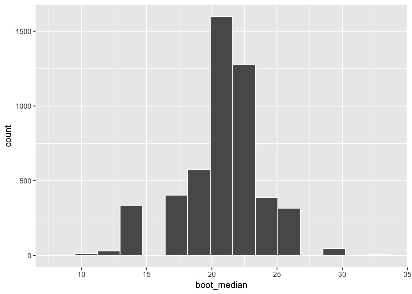
We see that the overall shape is similar compared to the sampling distribution shown above.
( ciq_median <- confint(bootstrap_medians, level = 0.95, method = "quantile") ) name lower upper level method estimate
1 boot_median 13.2 25.8 0.95 percentile 21.3This confidence interval is a bit wider than the \((14.62, 24.76)\) confidence interval that was given for the population mean in the slides. This makes sense since the median appears to have more variability going from one sample to another than the mean does. The small sample size here of 25 could also be contributing to this.